Design Emails That Your Subscribers Will Read: Here's How

Contents
Are you tired of sending out email campaign after email campaign and not getting the response that you want?
It may be time to rethink your design.
In this blog post, we'll share some tips on how to design emails that will get your subscribers' attention and have them clicking through to your content.
So, if you're ready to start seeing better results from your email campaigns, keep reading!
6 Tips to Design Effective Emails

An effective email design can help you capitalize on branding and recognition to create a connection with your readers. Here are 6 tips to create a consistent experience with your subscribers:
1. Choose a goal for your email.
Each of your emails should contain an action for your reader to take. Do you want them to read your blog post? Attend your event? Donate or volunteer?
Your email design should reflect this goal and, with the exception of an e-newsletter, only contain 1 call-to-action per email. If you provide your reader with an overload of options, then they may not click any, which defeats the purpose of your email marketing efforts.
2. Use headings and subheadings.
With our increasingly busy lives and email being available at our fingertips at all times, we have naturally become used to skimming the content in our inbox. Take that into consideration when you create emails. Be sure to highlight the most important information so that if your readers do skim, they take away the most essential parts of your message.
Your headings and subheadings should be short sentences or phrases that are bolded and a bigger font size than the rest of your email copy.

3. Keep your copy concise and use white space.
This is also important because of skimming habits. Avoid writing a wall of text because your readers will more than likely not take the time to read it.
By inserting line breaks or lists within your email copy, you provide white space. White space is the blank space in between text and images that helps create a visually appealing result.
It can be overwhelming on your reader if there is too much text and not enough whitespace. On the flip side, it can feel underwhelming and empty if there is too much white space and not enough text or imagery. Find a happy medium between the two to better deliver your content to your subscribers.
4. Use responsive templates.
Did you know that 54% of emails are opened on mobile? Imagine how irrelevant your emails are to some of your contacts if you don’t use a responsive email template.
Your mobile readers will be less likely to interact with your emails if they are difficult to read on a smaller screen. You can lose credibility in the eyes of your subscribers if you don’t provide a responsive mobile experience with your emails.
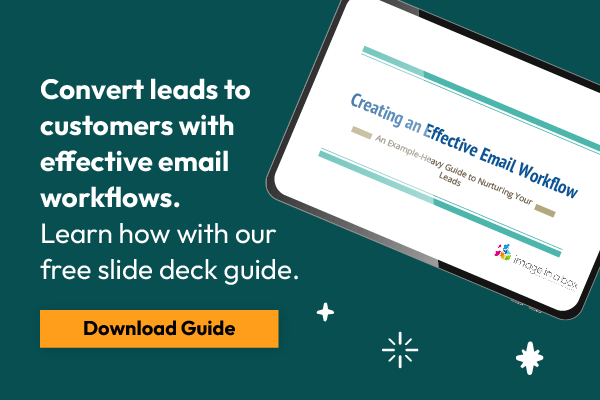
Convert more leads with better emails.
Download our FREE Email Marketing Guide now! Click here to get started.
5. Use images wisely.
Images are one of the best ways to make emails visually appealing and interesting. However, there are so many ways for the use of images to go wrong and backfire on your intent of hooking your reader.
In short, when you design emails exclusively around images, your engagement will decline. This is because not all email service providers will display your images by default. Additionally, using too many images can send your email straight to your recipient’s spam folder!
Here are a few do’s and don’ts to ensure you are using images wisely in your emails:
- Do not send an email that is one big image
If your email copy and CTA is all included in one graphic, you can be sure that some of your readers will not receive it correctly. Email images should be used to capture your audience’s attention and complement the email copy.
- Do not make CTAs a graphic button
While you want to draw attention to the goal of your email, it can all go to waste if your call-to-action is an image file. You can use HTML and CSS to create a button that stands out against your others images and copy.
- Do provide alt-text
If your recipient’s email service provider doesn’t display images by default or your recipient has blocked receiving images in emails, then you need to ensure you have alt-text on your images.
Alt-text will appear in place of these images, so you should you use this text to describe the image that they are missing. You can also get creative and use it as a call-to-action, like “Read the blog post to find out more”.
Images can be powerful in helping deliver your message, but use them moderately and wisely in your emails.
6. Include CAN-SPAM compliant details.
Since you must abide by CAN-SPAM requirements if you send commercial emails, you might as well include them in your design. This will save you time from having to type it in every email. You can place these details in the footer of your design.
If you use a large email marketing platform (MailChimp, Constant Contact, Emma, etc.), then they will automatically ensure you include these details in your email design.
CAN-SPAM compliant details include:
• Your organization’s name
• Your organization’s physical address
• An unsubscribe link
You have to give your readers the ability to stop hearing from you. However, if you provide your readers with valuable, relevant content, then the likelihood of them using this feature is lower.
By using these tips in your email design, you’ll deliver your content effectively to your subscribers.
Design and copy go hand-in-hand when creating an effective email, so be sure to give both a lot of attention before hitting the send button.
Want more tips? Download our free Email Marketing Guide now!